
Alert configuration
Alert configuration sets the alert type and how it behaves: when it opens, where it appears, when it is scheduled, how it closes and how often each person sees it. Some settings change with the alert type.
Alert type: Alert
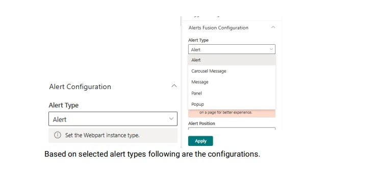
- Alert type
- Choose how the content is shown: Alert, Carousel Message, Message, Panel or Popup.
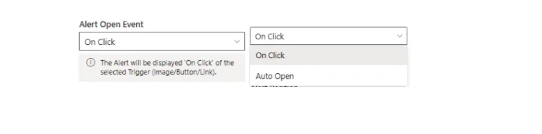
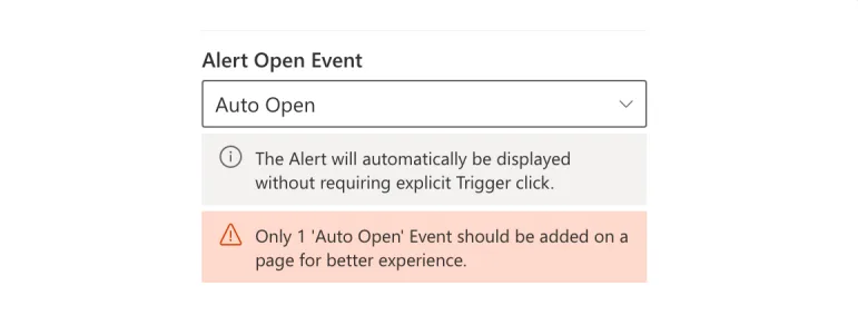
- Alert open event
- On Click opens the alert when someone clicks the trigger. Auto Open opens it when the page loads, and lets you hide the trigger. Auto close after a number of seconds is available for every alert type.
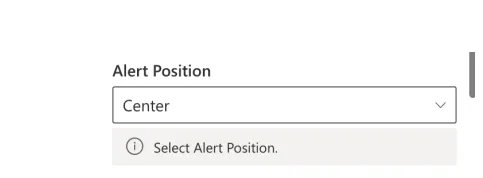
- Alert position
- Where the alert, carousel message bar, message bar, panel or popup appears on the page.
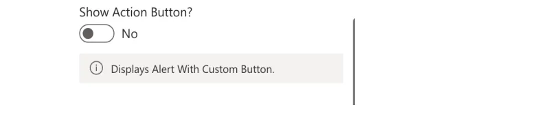
- Show action button (Alert only)
- Adds a button inside the alert.
- Alert button text
- The label of the action button, when it is turned on.
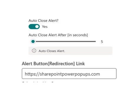
- Alert button (redirection) link
- Any web address the action button opens.
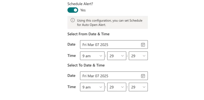
- Schedule alert
- Set the date and time range in which automatic alerts are shown.
- Auto close alert
- Closes the alert after the time you set.
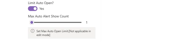
- Max auto alert show count
- How many times the alert opens automatically for each person. After that, it no longer opens on page load for them.
Alert type: Carousel message bar
- Message open event
- Open the carousel message bar manually or automatically.
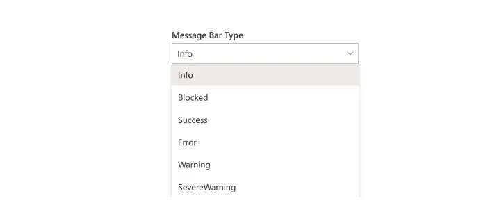
- Message bar type
- Six types: Info, Success, Blocked, Warning, Severe Warning and Error.

- Icon picker and clear icon selection
- Choose any Fluent UI icon to show instead of the default icon for the bar type, or clear your choice.
- Show multi-line message bar
- Adjusts the bar height to fit longer content.
- Show expand button
- Adds an expand and collapse button so people can resize the bar to read longer content.
- Message bar position
- Top of the page, bottom of the page, or in place of the web part.


- Auto dismiss the message bar
- Turns on automatic closing, with a slider to set the number of seconds.

Alert type: Panel
- Panel title and title style
- The heading shown at the top of the panel and its font style.
- Panel open event
- Open the panel manually or automatically.


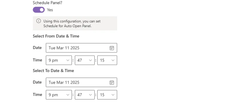
- Schedule panel
- From and to date and time pickers that set when the panel opens automatically, with no manual work.
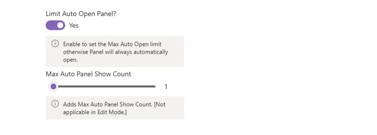
- Limit auto panel
- After a person has seen the panel this many times, they need to click the trigger to open it again.
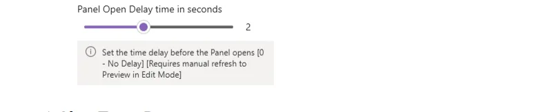
- Panel open delay
- A slider that sets the delay before the panel opens automatically.
Alert type: Popup
- Popup open event
- Open the popup on click or automatically.
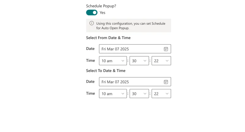
- Schedule popup
- Show the popup automatically between the dates and times you choose.
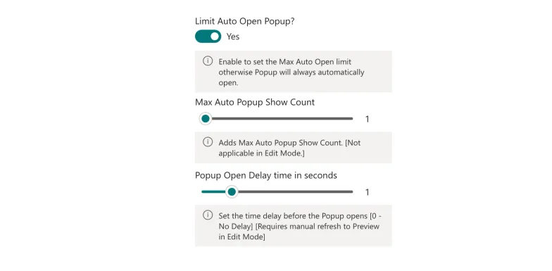
- Limit auto open popup
- Set the maximum number of automatic shows. After that, people click the trigger to open the popup.
- Popup open delay and auto close
- Delay the automatic opening, and close the popup automatically after a set time.


- Redirect visitor on close (not available for panels)
- Send people to another page when the popup closes. Set the redirect URL, the redirect target (same tab or new tab) and the redirect triggers that cause the redirect.
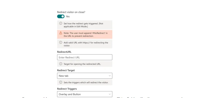
To edit a page that has a redirect set, add #NoRedirect to the end of the page address. You will not be redirected, so you can change the page.
- Popup position and popup animation
- Where the popup appears and the animation it uses to open.


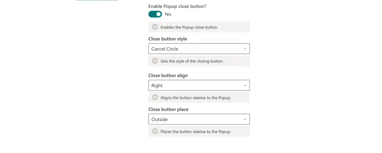
- Popup close button (not available for panels)
- Show a close button and set its style, alignment and placement relative to the popup.
- Enable ESC key (not available for panels)
- Let people close the popup with the Esc key. This works on the published page.

- Overlay (popup only)
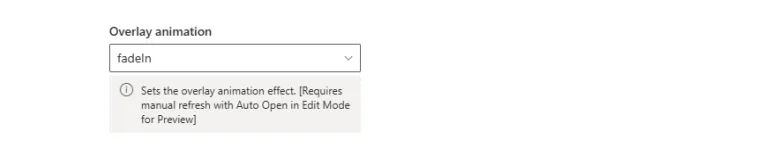
- Show a dimmed overlay behind the popup, choose whether clicking the overlay closes the popup, and pick the overlay animation.


Next: content configuration.