
Content configuration
Content configuration decides what an Alerts Fusion alert shows and how big it is. You can pull content from a page, a SharePoint list, your own HTML or rich text.
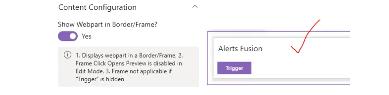
Show web part in a border or frame
Adds a border around the web part on the page.
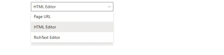
Content source
Choose where the content comes from: Page URL, SharePoint List, HTML Editor or Rich Text Editor.
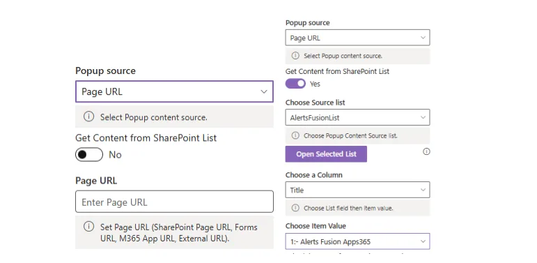
Page URL and SharePoint lists
Show any page address as the alert content, or fetch content from the columns of a SharePoint list.
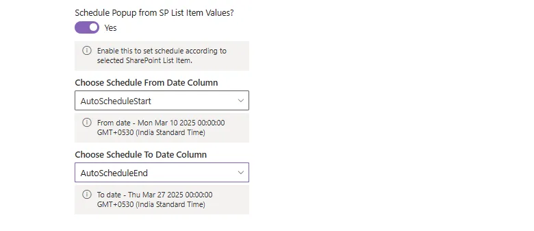
When the content comes from a list item, the alert can follow the dates stored on that item, so you do not have to set an automatic open schedule by hand.
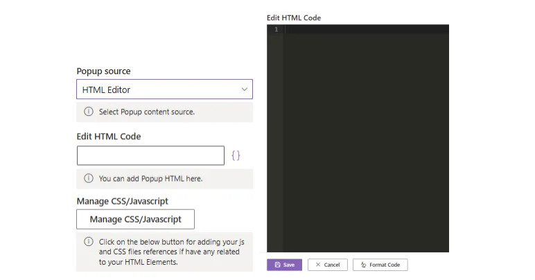
HTML editor
Add your own HTML, plus any JavaScript or CSS files it needs to style the content, using the Manage JS/CSS button.
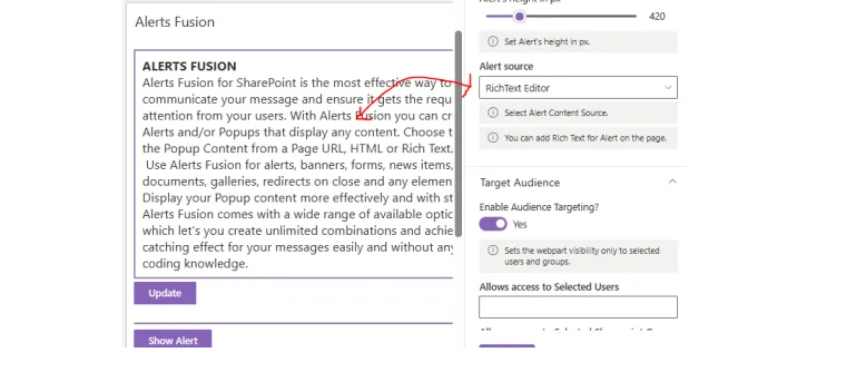
Rich text editor
Write formatted text directly on the page and select Update to save it. This is the default content type.
Settings for each alert type
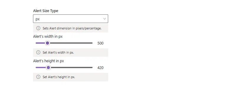
- Alert
- Set the alert's width and height.
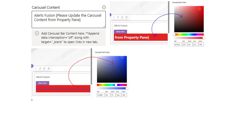
- Carousel message
- Type the carousel content or fetch it from SharePoint, then set the carousel bar colour and text colour.
- Message
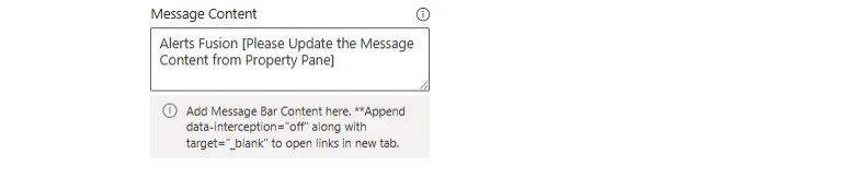
- Type the message content or fetch it from SharePoint.
- Panel
- Set the panel width with a slider. It is 50% by default.

- Popup
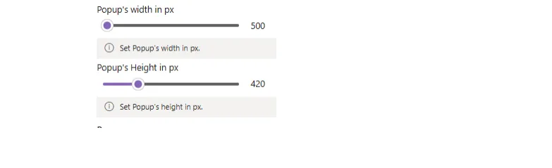
- Type the popup content, or turn on the toggle to fetch it from any SharePoint list. Set the popup width (up to 1024 px) and height (up to 768 px), or choose percentage sizing to set the size in %.
Next: target audience.